9 Workflow
10 Data Analysis Workflow
In a typical data analysis workflow, you should be able to follow the data from the moment it is read into RStudio until you save the plots, tables, and the clean data. The data analysis can be done in one or several scripts. Using several scripts often makes it easier to manage if it is a larger process. This usually means that at the end of one script, the data is saved (for example, after cleaning the data as a new file), and then at the start of the next script, it is read in.
10.1 End goal
In the end of a data workflow it is expected to have raw data, clean data, analysis data, Tables and Figures:
- Raw Data:
- Unprocessed, original data.
- Contains all collected variables and observations.
- Example: Initial survey responses as a .csv or .xlsx.
- Clean Data:
- Data after basic cleaning.
- for example duplicates removed, errors corrected.
- Analysis Data:
- Data transformed for specific analyses.
- Subsetted, aggregated, and new features created as needed.
- Tables:
- Structured data summaries.
- Descriptive statistics, test results, tables for scientific articles.
- Figures:
- Visual data representations.
- Charts, graphs, and plots to highlight key insights.
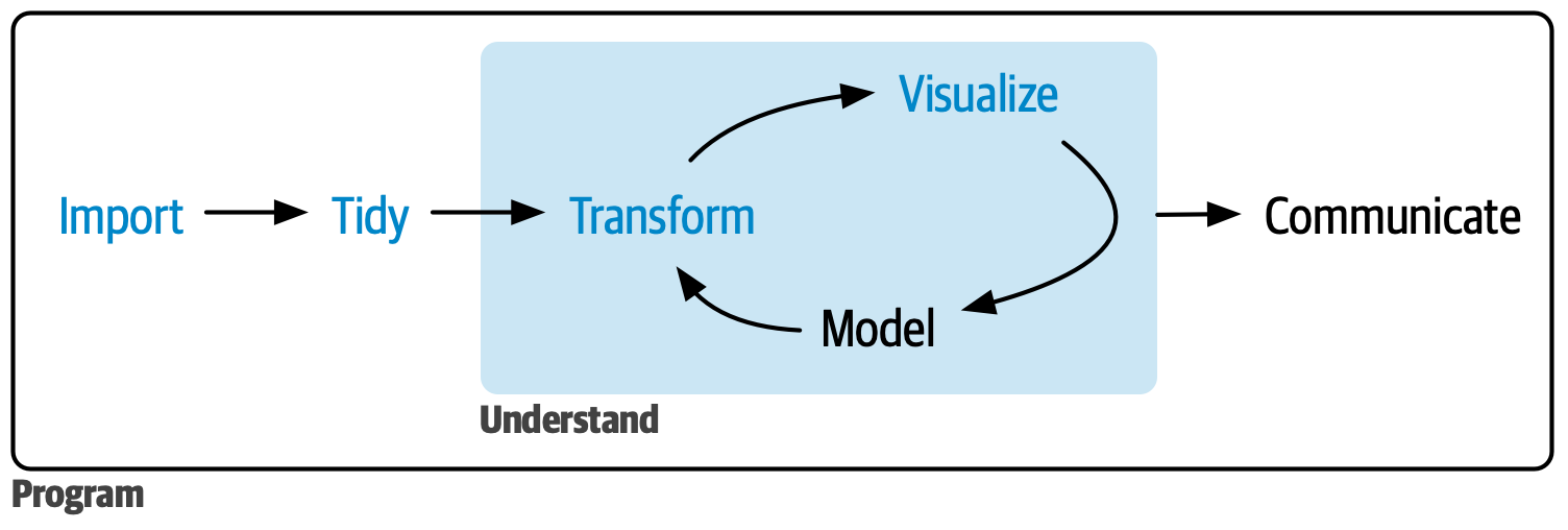
A figure from Hadley Wickham describes the a workflow process in a simplistic way:
However, the process could also be defined in 9 steps. Typical steps in a finalized data analysis workflow are as follows. Keep in mind that from the beginning, it is an iterative work process, meaning that you often go back and forth between the different steps. In some cases the process can even be near simultaneous such as the one between data wrangling and data exploration. Further all steps are not allways nessessery. Even experienced data analysts might disagree exactly how these steps should be executed.
10.2 Workflow Steps
- Define Objectives:
- Clearly define the goals and objectives of the analysis.
- Determine the questions to be answered.
- Possible hypotheses to be tested.
- Clearly define the goals and objectives of the analysis.
- Data Collection:
- Gather data from relevant sources, e.g.:
- Databases
- APIs
- Surveys
- Experiments
- Gather data from relevant sources, e.g.:
- Data Import:
- Import data into the RStudio environment.
- Use functions like
readr::read_csv()oropenxlsx::read.xlsx()together with thehere::here()function to import data.
- Use functions like
- Import data into the RStudio environment.
- Data Wrangling:
- Data integration
- Combine multiple datasets.
- Convert data structures (e.g., pivoting between long and wide formats).
- Merge or split variables/columns.
- Data cleaning
- Standardize formats (e.g., dates, categorical variables).
- Correct data types (e.g., character, numeric, dates).
- Set variables as factors. See more here.
- Handle outliers, and duplicates.
- Handle erroneous values, such as missing data or invalid entries.
- Construct new variables, for example composite variables, score variables, aggregated groups, outcome variables.
- Data management and documentation
- After this step data can be saved as clean data with
write_csv(). - A possibility after this step is to create an data dictionary with meta data, for example with
datadictionary::create_dictionary(data)orskimr::skim(data).
- After this step data can be saved as clean data with
- Data integration
- Data Exploration:
- Summary statistics
- Descriptive Statistics: Compute measures such as mean, median, standard deviation, quartiles, and range for numerical variables.
- Frequency Counts: Analyze frequency and distribution of categorical variables.
- Data Visualizations, for example:
- Histograms and Boxplots: Assess the distribution and identify potential outliers for numerical variables.
- Bar Charts: Visualize the distribution of categorical variables.
- Scatterplots: Explore relationships between pairs of numerical variables.
- Heatmaps: Visualize correlation matrices to understand relationships between multiple variables.
- Pair plot: A grid of scatterplots used to visualize the pairwise relationships between multiple variables in a dataset.
- Trend plots: Identify trends over time if the dataset includes temporal data.
- Correlation/Association
- Pearson: Measures the linear relationship between two continuous variables.
- Spearman: Measures the monotonic relationship between two continuous or ordinal variables.
- Cramers V: Measures the strength of association between two categorical variables.
- Cross-tabulations
- Explore relationships between categorical variables.
- Dimensionality Reduction for high-dimensional data
- Principal Component Analysis (PCA) to reduce the number of variables and identify underlying patterns.
- Multiple Correspondence Analysis (MCA) similar to PCA but adapted for categorical data.
- Factor Analysis of Mixed Data (FAMD), combines PCA and MCA.
- Summary statistics
- Data selection:
- Select data that will be used in your analyses
- Exclude individuals/tests/variables/values as needed.
- Further transform data if needed.
- Data Analysis and Modeling:
- Apply summary statistics, statistical methods, machine learning algorithms, or other analytical techniques to the data.
- Use statistics such as mean, median, t-test, regression, clustering, cox, classification, time series analysis, etc.
- Extract data from models to rectangular data frames.
- Results Visualization and Tables:
- Create visualizations. Use plots like forrest plots, line graphs, scatter plots, heatmaps, etc. For inspiration.
- Create tables. For inspiration.
- Save and Export:
- Save data, figures, tables, and models. Use desired formats (e.g., CSV, Excel, PDF, PNG).